先日画像にリンクがある場合に画像を透過させるCSSでの方法を記載しました。
画像にリンクがある場合にCSSだけでゆっくりと透過させる方法
こちらの続編で忘れないうちに記事にして備忘録として残しておこうと思います。
テキストにリンクがある場合にアニメーションをつける方法11個です。
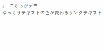
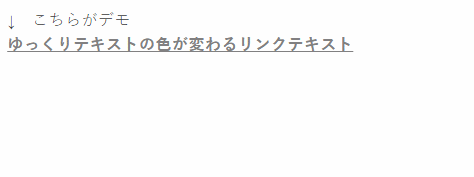
まずは、現在の私のサイトでも採用しているテキストにリンクがある場合にゆっくりと色が変わるアニメーション効果を再現するCSSです。
a {
 color: #808080;
 text-decoration: underline;
 -webkit-transition: .8s;
 -moz-transition: .8s;
 -o-transition: .8s;
 -ms-transition: .8s;
 transition: .8s;
 }

 a:hover {
 color: #ffd700;
 }
こちらのデモです。

次に、テキストにリンクがある場合にゆっくりと背景色が変わるリンクテキストアニメーションのCSです。
a {
 color: #f5f5f5;
 background: #a9a9a9;
 text-decoration: none;
 -webkit-transition: .8s;
 -moz-transition: .8s;
 -o-transition: .8s;
 -ms-transition: .8s;
 transition: .8s;
 }

 a:hover {
 color: #f0f8ff;
 background: #ff99cc;
 }
デモは以下になります。

次に、テキストにリンクがある場合に拡大するアニメーション効果をつけるCSSの方法です。
a {
 display: inline-block;
 color: #4169e1;
 -webkit-transition: .3s;
 -moz-transition: .3s;
 -o-transition: .3s;
 -ms-transition: .3s;
 transition: .3s;
 }

 a:hover {
 -webkit-transform: scale(1.2,1.2);
 -moz-transform: scale(1.2,1.2);
 -o-transform: scale(1.2,1.2);
 -ms-transform: scale(1.2,1.2);
 transform: scale(1.2,1.2);
 }
以下がデモになります。
次に、テキストにリンクがある場合に中央からアンダーラインが現れるアニメーション効果をつけるCSSの方法です。
a {
 position: relative;
 display: inline-block;
 color: #4169e1;
 padding: .4em;
 text-decoration: none;
 }

 a:hover {
 color: #ff69b4;
 }

 a::after {
 content: '';
 position: absolute;
 bottom: 0;
 left: 0;
 width: 100%;
 height: 1px;
 -webkit-transform: scaleX(0);
 -ms-transform: scaleX(0);
 transform: scaleX(0);
 background-color: #ff69b4;
 -webkit-transition: all .3s ease;
 transition: all .3s ease;
 }

 a:hover::after {
 -webkit-transform: scaleX(1);
 -ms-transform: scaleX(1);
 transform: scaleX(1);
 }
以下がデモになります。

次に、テキストにリンクがある場合にマウスオーバーで傾いてしまうアニメーション効果をつけるCSS方法です。
a {
 display: inline-block;
 transition: .3s;
 }
 a:hover {
 transform: rotate(5deg);
 }
以下がデモになります。

次に、テキストにリンクがある場合に縦にくるっと一回転するアニメーション効果をつけるCSS方法です。
a,
 a span {
 display: inline-block;
 }
 a span {
 transition: .5s;
 }
 a:hover span {
 -webkit-transform: rotateX(360deg);
 transform: rotateX(360deg);
 }
以下がデモになります。
注意)
この一回転させる場合にはHTMLの記述も以下のようにしなければなりません。
この場合のHTMLの記述
<a href=”リンク先のURL”><span>リンクテキスト</span></a>
簡単に言うと、
リンクテキストをさらに<span></span>で囲って上げる必要があります。
次に、テキストにリンクがある場合に背景が左から現われるアニメーションつけるCSSの方法です。
a {
 padding: 0 .3em;
 text-decoration: underline;
 background-image: linear-gradient(to right, rgba(0,0,0,0) 50%, rgba(255,187,255,1) 50%);
 background-position: 0 0;
 background-size: 200% auto;
 transition: .3s;
 }
 a:hover {
 background-position: -100% 0;
 text-decoration: none;
 color: #fff;
 }
以下がデモになります。

次に、テキストにリンクがある場合に下から背景が現われるアニメーションをつけるCSSの方法です。
a {
 padding: 0 .3em;
 background-image: linear-gradient(rgba(0,0,0,0) 50%, rgba(255,187,255,1) 50%);
 background-position: 0 0;
 background-size: auto 200%;
 transition: .3s;
 }
 a:hover {
 background-position: 0 100%;
 color: #fff;
 }
以下がデモになります。

次に、テキストにリンクがある場合にマウスオン時にふわっとアンダーラインが出てくるアニメーションをつけるCSSでの方法です。
a {
 position: relative;
 display: inline-block;
 text-decoration: none;
 transition: .3s;
 }

 a:hover {
 color: #ff80ff;
 }

 a::after {
 position: absolute;
 bottom: .3em;
 left: 0;
 content: '';
 width: 100%;
 height: 1px;
 background-color: #ff80ff;
 opacity: 0;
 transition: .3s;
 }

 a:hover::after {
 bottom: 0;
 opacity: 1;
 }
以下がデモになります。

次に、テキストにリンクがある場合にアンダーラインが左から現われるアニメーションをつけるCSSの方法です。
a {
 position: relative;
 display: inline-block;
 transition: .3s;
 text-decoration: none;
 }
 a:hover {
 color: #ff80ff;
 }

 a::after {
 position: absolute;
 bottom: 0;
 left: 0;
 content: '';
 width: 0;
 height: 1px;
 background-color: #ff80ff;
 transition: .3s;
 }
 a:hover::after {
 width: 100%;
 }
以下がデモになります。

最後に、テキストにリンクがある場合にマウスオン時に上下にラインが現われるアニメーション効果をつけるCSSの方法です。
a {
 position: relative;
 display: inline-block;
 text-decoration: none;
 transition: .3s;
 }

 a:hover {
 color: #ff80ff;
 }

 a::before,
 a::after {
 position: absolute;
 content: '';
 width: 0;
 height: 1px;
 background-color: #ff80ff;
 transition: .3s;
 }

 a::before {
 top: 0;
 left: 0;
 }

 a::after {
 bottom: 0;
 right: 0;
 }

 a:hover::before,
 a:hover::after {
 width: 100%;
 }
以下がデモになります。

以上テキストにリンクがある場合にアニメーション効果を簡単にCSSのみでつける方法11選でした。
もう一度最後にです。
色などの部分は気に入ったものをご自分でカラーコードを変更して使用してみてください。
色のカラーコードを確認する場合に参考になるサイトはいろいろありますが、
今回は元祖20年前の1997年からカラーコードについてのサイトである以下のサイトを紹介させていただきます。
 WEB色見本 原色大辞典 - HTMLカラーコード色の名前とカラーコードが一目でわかるWEB色見本
是非、参考にして他のサイトとの差別化などしてみてください!!
追記)
すみません。デモのgifアニメーションが2個めから混ざってしまったものになっています…。


新着コメント